

The past decade has witnessed a dramatic shift in how people access information on the Internet -- from desktops and laptops to literally having the world wide web at the palm of our hands.
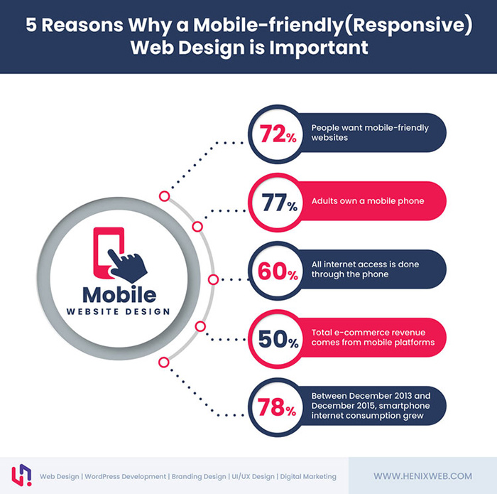
With 90% of the global Internet population using a mobile device to go online, it's no longer enough for brands and organizations to have a static website. The days of designing a website solely for desktop screens are ancient history.
Innovations in mobile device technology, coupled with the expansion of mobile websites, have indeed pushed business owners to re-think their website strategy and challenged designers to find ground-breaking ways to showcase their work across different devices and screen sizes.
This is where responsive web design comes into play --a unified design that encompasses cell phones, tablets, laptops, and desktops.
What is Responsive Web Design?
You'll hear no shortage of experts singing praises about responsive web design. And after Google recommended the technique last year, it has taken the online world by storm.
But what is responsive design, really?
Responsive web design (RWD) is an approach to website design that enables the code and contents to adjust and respond to different devices, screen sizes, and orientations. As a result, your content becomes flexible enough to move freely and adapt to all devices, and the user gets an optimal viewing experience regardless of what screen or resolution he/she is using.
In a world where people constantly switch between their mobile phones, tablets, and laptops, the responsive design approach allows web admins to create flexible websites that can adjust to whatever type of device they're accessed from.
Responsive vs. Adaptive vs. Mobile-first
Several terms are repeatedly used to describe the process of optimizing a website's design for various screens, namely: responsive, adaptive, and mobile-first designs.
Some people use responsive design and adaptive design interchangeably. But while these two are closely related, they are not one and the same. Responsive design uses CSS media queries to change style based on the target device. No matter what the browser's size or width may be, the site adjusts its layout, contents, and functionality in a way that is optimized to the screen.
Adaptive design, on the other hand, adapts to the width of the browser at specific breakpoints. A script checks for the screen size and then delivers the template specifically designed for that device.
As for mobile-first, this is simply a conceptual term that refers to the practice of designing or developing an online experience that prioritizes the mobile version over the desktop version.
Three Principles of Responsive Design
Three main principles come into play for a responsive website to work on all devices and screen sizes: fluid grid, flexible texts and images, and media queries. These techniques are applied at different viewport widths on the user's device through multiple specific Cascading Style Sheets (CSS).
1. Fluid Grid Systems
This approach adopts the concept of relative size, where the website's elements resize according to the device's specifications. The layouts are based on percentage value instead of set pixels.
2. Flexible Text and Images
This principle refers to the use of scalable texts and media contents that change in size as the viewport, or the user's visible area of the webpage, changes. Designers use a CSS command to ensure that the content displays at its maximum pixel value.
3. Media Queries
This functionality allows designers to change and specify the website's layout according to the size of the browser window. For example, a web page with three columns when accessed on a desktop might adjust and appear with only one column on a smartphone to provide a better viewing experience to users.
Tips and Tricks for Creating Responsive Design
As Steve Jobs said, "Design is not just what it looks and feels like. Design is how it works."
Responsive websites provide users a more enjoyable and satisfying online experience across different devices. As a result, consumers are encouraged to browse the website longer, make a purchase, and revisit the website in the future.
If you're looking to improve the performance of your website and offer your customers next-level user experience, here a few proven and tested responsive web design techniques worth looking into:
Tip #1: Use a fluid design approach.
People will access your website using a variety of devices with different screen sizes and resolutions. Using the fluid design approach instead of a fixed-layout will provide them with an optimum viewing experience regardless of whether they're opening your website on a desktop or a smartphone.
Fluid web design uses a fluid grid to make the process of adjusting the sizes of your page elements for different screens easier and more convenient. The grid is made up of columns that expand and shrink according to the device's screen size. All the page components are sized in proportion to the grid. They flow with the expansion/shrinkage of the columns to adapt to the user environment.
Tip #2: Mind the typography.

Typography should be a priority when building a website. This goes both for traditional and responsive website design.
Your choice of font style, font size, and text arrangement affect the readability and overall appeal of your website. If visitors find your text arrangement too scattered and your typefaces challenging to read, they won't bother finding out what your website has to offer.
You can make your website easier on the eyes by going for clean and legible fonts. Careful consideration of the different components of typography design (hierarchy levels and line lengths, color contrast, and text amount) will also help balance your website's visual structure.
Tip #3: Create whitespace.
Aesthetics and user experience are vital to creating a responsive website, and you can fulfill both these requirements by creating whitespaces in your web design. You can add whitespaces to your website by adjusting the line spacing, experimenting with the font sizes, trying out various margin settings, and padding your texts.
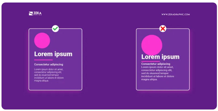
The proper use of white space will elevate the look of your website and help draw attention to the essential contents of the page. Allowing you content to breathe also keeps it from looking messy or cluttered, especially when viewed on smaller screens or mobile devices.
Tip #4: Choose media elements carefully.
Your choice of media elements has a direct impact on the responsiveness of your website. The quality and resolution of the videos, images, and infographics you use can affect page speed and, ultimately, website performance.
For one, using high-resolution images on your website is discouraged. Yes, they're more visually appealing, but they also take up a lot of space, leading to slow load times.
To maintain the quality of your medial elements without sacrificing site performance, compress your videos and use flexible images. Despite their smaller size, flexible images are scalable, so they'll remain crisp and clear on both desktop and mobile.
Tip #5: Use icons only when appropriate.
Adding icons to your website has a twofold advantage. One, it contributes to the responsiveness of your by eliminating long bursts or text. Two, it can make your content look more interesting and easier to absorb. However, you should avoid using icons excessively, as this will defeat their purpose.
Icons are best delivered to a website in an SVG (Scalable Vector Graphic) file format. SVG files are perfect for multi-device-friendly websites because they're scalable. They can adjust to different devices without compromising quality or changing the file size.
Tip #6: Make navigation easy.
When designing your website, always keep in mind that many of your visitors may not be tech-savvy. If your web pages are too complicated to navigate, your customers would likely quit browsing and leave.
Making navigation easier is one of the most challenging aspects of web design, but it's a worthy feat. You can make your website easier to navigate by adding a conveniently located menu bar and a search bar on top. Also, try to apply the three-click rule when possible. According to this rule, users must be able to find whatever information they're looking for in a website within three mouse clicks.
Tip #7: Reduce page load time.
A few seconds can feel like an eternity when waiting for a website to load. If you don't want potential customers to abandon your site for your competitor's, improve your page load time at all costs.
You can reduce your website's load time by using optimized media files, reducing the number of plug-ins, and doing away with tons of redirects. Remember that speed of your website is directly proportional to the satisfaction of your customers --- and satisfied customers are easier to convert.
Advantages of Using A Responsive Website Design
Any brand that's serious about providing its audience with the best online experience across all devices should consider investing in a responsive website. Responsive web design is so much more than just a trend; it has become an essential way of thinking behind building successful websites.
Still unsure about going responsive and giving your website the makeover that it deserves?
These benefits of a responsive website will convince you to go for it.
Enhanced User Experience
RWD provides a smoother, seamless, and more consistent user experience, not just for your audiences but for your company as well. This means no more unnecessary clicks, endless scrolling, or constant zooming-in to read texts on mobile devices.
This year, Google is officially including UX as one of its ranking factors for web pages. Creating an overall positive impression for your website can boost the credibility of your business and, consequently, improve your sales and conversion rates.
Lower Bounce Rates
Having high bounce rates is a double whammy for a website. One, this means that a significant percentage of users leave your website within seconds. Two, Google can take it as a sign that your web page does not provide relevant information to user's queries, and your SERP rankings may take a hit as a result.
Besides poor quality content, web design issues are a major contributing factor to a high website bounce rate. Navigation issues, readability problems, and a confusing or messy layout can drive people away. Luckily, adopting a responsive web design can resolve all those problems.
Flexible Website Management
One of the best things about using a responsive website design is that it allows you to maintain a single site for all devices. If you want to make any changes to your content or any part of your website, you only have to do it once.
The flexibility of responsive websites is a massive advantage in terms of website management. You don't have to waste precious time updating multiple versions of the same web page so that you can dedicate the better part of your time and energy to other important aspects of your business.
Lower Website Maintenance Cost
Before the introduction of RWD, businesses used to maintain two websites – one for desktop users and another one for mobile users. Nowadays, though, you only need one version of your website to cater to all types of devices.
Investing in RWD allows you to maintain both your desktop and mobile pages using the same domain. Most importantly, it eliminates the hassle and expenses associated with running multiple versions of the same website.
Overall Better SEO Results
Responsive websites look better, load faster, and provide a great user experience. All these characteristics tick the right boxes on Google's ranking factors, which is why websites that utilize RWD are likely to rank higher in search results than those that don't.
Businesses have been competing for a spot on Google's first page because search engine rankings can make or break a business. Websites that appear on top tend to have more traffic and experience an overall boost in their SEO results.
Suppose you want to leverage your website and hit your business goals time and time again. In that case, you need to carefully evaluate your website's design and act according to the best interest of your business and – of course – your consumers.