

Admit it. Smartphones, tablets, and other mobile devices have become a significant part of your day-to-day activities.
You use it to send and check emails, organize tasks, schedule appointments and events, take photos and videos, create or write documents, shop, find restaurants, read the news, find places, and communicate with family and friends. You probably even use your device for work-related tasks, such as a mobile marketing campaign. In other words, you use your smartphone for practically anything.
Since mobile devices have smaller screens than desktops and laptops, using them when visiting your favorite websites does not guarantee you a satisfying experience. It is for this reason that the mobile-first design philosophy was born.
What is a Mobile-First Design?
Mobile-first design is a concept first introduced in 2010 by former Google CEO Eric Schmidt. At that time, he was already focusing on mobile architecture. Fast forward to ten years later, and smartphone users now number to over three billion.
The mobile-first design process begins with developers designing from mobile devices, considered to have the smallest screen. Websites are designed, prototyped, and optimized to fit mobile screens. As such, designers adjust their designs to fit the limited size of mobile devices screens. This responsive design process allows users to enjoy convenient and seamless experiences across different devices.
If you plan to create or design a responsive website, take note of and follow these essential mobile-first design practices.
Use the Hamburger Menu
The hamburger menu is an icon represented by three horizontal lines that somewhat resemble a hamburger. The top line is the top bun, the middle one is the patty, and the bottom line is the bottom bun. When users click the hamburger menu, the navigation menu comes out. It does not take up too much space, so it is an excellent alternative to the traditional navigation bar.
The Spotlight is on Content
When you scroll through a website using your smartphone, you’ll want to quickly and conveniently find all the content you need. This kind of convenience is also what your users want. You have to design the website so that when the page loads, they will immediately see that element or content that first caught their attention. Remember, your space is limited, so you have to make the most of it.

Visual hierarchy is an important content mobile-first design practice that arranges website content or elements according to which one is the most important. Using visual hierarchy also means adjusting contrast and color to attract users’ attention, choosing the right typefaces or fonts, and enhancing the size of design elements.
Use these three questions as a guide to formulating your mobile-first design visual hierarchy:
-Where will users or visitors’ eyes first focus on?
-Where will they look next?
-Where will they look last?
Another technique is to imagine yourself holding and navigating your smartphone with only one finger or thumb. Which areas of your phone are easy to reach, and which ones are not? Design your content with these considerations in mind, and you’re guaranteed to provide the convenience mobile device users want.
Efficient Load Time
Nothing is more irritating than a website that loads slowly, especially on mobile devices. Imagine how users react if they have to wait for more than five (or even two) seconds for the page to load. Imagine how frustrating such an experience can be; it’s like the feeling you get when you’re thirsty and can’t seem to open a bottle of frozen soda.

To ensure efficient loading time, make some adjustments to some elements. A good example is minimizing the sizes of your files, particularly the images. However, be careful not to make your images too small as your viewers may not see them anymore.
To preserve the quality of your images, resize them before you upload them. There are tools you can use for minimizing file sizes. Using these tools helps guarantee that the photos’ quality remains the same.
Adapt A Simple Design
Clutter is never a good thing, especially when you are talking about mobile design. Clutter distracts readers. It turns away visitors. Readers would not know what to focus on because there are too many elements that try to grab their attention. You have to keep things as simple as possible. After all, simple is beautiful, right?
Keep your website mobile and visitor-friendly by focusing on clarity and removing anything that contributes to confusion and clutter. Here are some examples of what you can do:
- Limit your content to two columns; no more, no less.
- Reduce the number of pages on your website.
- Learn to take advantage of white spaces to minimize clutter, make the content easier to read, and keep the layout xclean and pleasing to the eyes.
- Use typography that is ideal for small screen devices, such as mobile phones.
- Lessen the links that you include in the navigation menu.
- Use wide borders and make sure all lines are clean.
If you want a mobile-friendly, user-focused website, you have to limit your content and the design elements to only those that you need.
Forget Popups
Popups are intrusive and annoying, and they waste people’s time. Google described them as intrusive interstitials and came out with a soft penalty for sites that distract visitors with popups. These intrusions block your visitors’ view, so it discourages them from further exploring your site.
Instead of placing important information on popups, make them a part of your content and place them above the fold or as a separate section on a page. It’s a win-win situation: you can post the info you need to post, popups won’t harass your viewers, and Google won’t penalize your website.
Adopt a Responsive Design
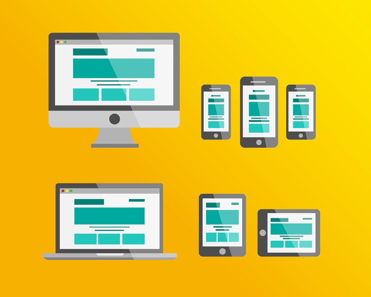
The goal of responsive design is to develop a one-page layout that automatically adapts to the device that each visitor uses. The degree of responsiveness of a website depends on five factors: the size of your images, number or size of videos, animation, content layout or order, and JavaScript.
Mobile-first design is about building products for multiple users and different devices. It is about offering consumers or visitors a smooth, satisfying, and convenient website experience.