Everything is getting compact today: the cars, the phones, the computers. But how is it that when everything is in your reach – literally everything with the power of technology – why is it that getting everything done is getting even more difficult?
Well…
Even answering this question is more difficult today than it once was. Who do we blame? The dynamic lifestyles today? The deteriorating environment? The stress levels? Technology?
In a much broader context, though, we know exactly who to blame: your attention!
Attention Spans and Us
Your attention has continually been falling over the past few years.

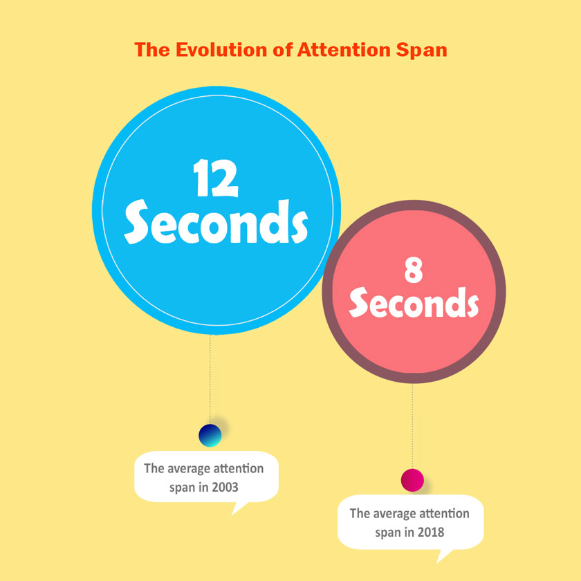
In fact, they haven’t been just falling. They’ve been falling fast. From 12 seconds in 2000 to 8 seconds in 2013, we now have attention spans less than a goldfish, and a goldfish spends its entire life in your fishbowl on a vase.
But why does this attention span even matter enough to be on this article and especially for businesses around the world to take notice?
Web Designs and Attention Spans
The briefest answer can be summed up into three words: it affects business.
How the general public reads and understands information and uses it, later on, affects how good businesses do now and in the future! And when businesses understand that people have smaller attention spans, they also understand that they must alter their touchpoints to suit these shorter attention spans.
And if there is a touchpoint more critical than any other, it lies on the internet: the website of every business.
But how does a website relate to how much attention spans people have? Well, everything about a website is about how much attention spans people have.

In the simplest terms, an average consumer has an attention span of only 8 seconds. So, your website has only about 8 seconds to make sure that your visitor sticks around. But you don’t have all that 8 seconds that we are talking about.
Say, your website takes 5 seconds from that to load. It wouldn’t take a Ph.D. to know that you will only have 2 seconds to grab the reader’s attention.

And in a world where attention spans are continually falling, everyone knows that the condition will keep getting worse. For now, if your webpage takes about 1 to 5 seconds to load, the bounce rate for your website will increase by a drastic 90%!
Minimalism in Web Designs and Attention
So, what do you really do to win against the curse of falling attention spans? Simple: you make it easier for people to stick around. How do you do that? Simple: make it easier for them to get what they want from your website.
Now, with all due respect, you cannot do that if you want to give your users every single thing that you can give them on one single page. It just doesn’t work.
If you really want to grab and then retain your visitor’s attention, you have to make use of what is called Minimalist Web Design. Why is it called minimalist? Because it's as simple as it can get. No extra details, no information overload, and no clutter.
Just plain, simple information. But wait, it isn’t just information. Minimal web design does not mean that you just put in a single line or two and hope the visitor’s stay. Contrary to popular beliefs, minimalist web design is not faster to create or involves less work.
The amount of thinking and strategic placement that goes behind a minimalist web design often takes more time than making a cluttered web page that offers every single thing on the first page. It takes plenty of time to prioritize what should be on the webpage and then remove the excess.
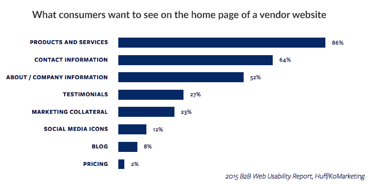
If it becomes too difficult to decide, here is what you should rely on:

Benefits and Minimalism in Web Design
But does it really work? Does minimalism in your web design yield any benefit at all to your webpage? Well, if you think about it, it gives you plenty of benefits.
1. More Responsive Website
A minimalist website does not just engage customers by way of its accurate information presentation on the webpage, but also by way of its more responsive design. If a site opens up in milliseconds or the very moment that you click on it, it is undeniable that the visitor is going to stay and find the information he/she wants from your very website.
This means that a responsive website ensures that more and more people are staying on the webpage.
2. Better Ranking
Google accounts for 76% of the total search traffic on Desktop and 86% on mobile. With that said, it becomes apparent that any website, to be successful, must optimize its website to be on top of the search results of Google.
Now, as it turns out, the Google algorithm prefers more responsive websites. So, with a minimalist design, you do not just retain more customers with faster loading and download speeds, but also bring up your webpage in the thousands of results that Google pulls up for you.
3. Easy Maintenance
Apart from the tangible benefits that can be seen in your sales and engagement figures, there is a hidden benefit to having minimalist web designs. That benefit is that a minimalist website is easier to maintain.
With lesser on the webpage itself – both on the front and backend – there is lesser that can go wrong. As a result, minimally designed webpages last longer than others and require much lesser maintenance.
Final Word
Whatever happens on the internet has profound consequences for any business. Therefore, it is vital to ensure that every business optimizes its presence on the internet in any way possible.
This includes the effort that goes into maintaining a webpage, especially ensuring it is as minimal as can be. Statistics and research dictate this will help business not just in the short-run, but also in the long-run.


