For an e-commerce website, design is a chance to make a successful first impression. It has a significant impact on how much time users spend there and how much money they spend there. It demonstrates the importance of all design aspects, from the stunning UI to the intricate UX, like no other. It's not only about how the website looks when it comes to e-commerce website design in a custom eCommerce development company but also about its functions. In addition to a well-thought-out marketing strategy, a visually appealing and functional wrap is needed. It just takes a few seconds for someone to determine whether or not to stay. The website is a tool to show consumers the value of goods and keep them engaged in a competitive e-commerce sector. People must have a reason to visit a website, and the design should serve as that reason.
The great thing about web design and tips is that a lot of it is focused on statistics and case studies. Although there is always space for imagination and ingenuity, data-driven advice demands measurable results. The aim is to increase sales of your brand's products. Whether it's by creative design elements or bold declarations, consumers will be intrigued and want to learn more. A great web design motivates users to take action and helps to build customer confidence in your brand. Sales are driven by step, and architecture exists to inspire users to purchase or reach out.

Use High-Resolution Images And Videos
Since visitors cannot see the items in person, they must rely on their photo and video presentations. This is an area where brick-and-mortar stores have an undeniable advantage. At least for the time being. As a result, high-quality images and videos are essential for modern e-commerce website design. The more accurate this portrayal is, the more likely consumers would enjoy the online store in question. High-resolution images, 360-degree views, 3D models, and videos are all included.
Maintain Minimalism
Keep it as straightforward and minimal as possible. Users dislike clumsiness. They prefer to use sites that are simple and do not necessitate extensive searching. Don't be afraid to use whitespace. They're essential for making things clear. Use the appropriate amount of whitespace between items and keep the whitespace consistent across the website. Consider using a grid menu with various categories represented by icons. This gives a clearer picture and increases the likelihood of user interaction. Wherever possible, use high-resolution images. Users prefer images to texts so they can see the message more clearly.
Emphasize The Branding

Consider the websites you're likely to purchase from: do they have a consistent theme on each page, product details and images that highlight the brand's personality, and precise advertising that makes it clear what they offer, or do they have a fragmented, basic design with no clear branding in the website?
You're more likely to buy something from a clean, easy-to-navigate website that offers concise details about the items they're offering. For an eCommerce platform, branding is crucial. Your visitors should be able to appreciate what you do and get a sense of your brand's personality as soon as they arrive on your website. Your personality should shine through on every page they visit.
Consider Yourself A Customer
It will help if you think like your audience to communicate with them. Finally, there are a few items your customers can expect from their shopping experience, including a well-designed, easy-to-navigate website that makes shopping online simple and easy. You must offer your customers exactly what they want if you want your site to succeed. If you want your custom eCommerce development company to interact with your audience, you must think like them. Simple to navigate, well-designed, and making the shopping process smoother are the top features the future customers want in an eCommerce experience. Put yourself in your visitors' shoes while designing an eCommerce website. What kind of interface would be the most user-friendly for them? How do you arrange your goods so that they make sense to your customers? How do you make the checkout process easier?
Make Sure That The Content Is Scannable

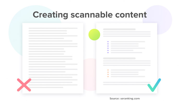
Your eCommerce website template has lengthy product descriptions, but your customers don't read them. According to research, most website users only read about 20% of the text on any given web page. They search the text for key details rather than reading it word for word, so if you want to get your point across (and drive sales in the process), you need to make your content scannable. Break up the content into an easy-to-scan format, whether it's product descriptions, blog posts, or a "about us" tab. Keep sentences and paragraphs short, highlight important details with bolding, and break up long text blocks with bulleted lists. The more efficiently your content can be scanned, the more likely your audience can absorb your main messages, and you'll be able to close a deal.
Keep It As Simple As Possible
Simplicity results in a cleaner, more user-friendly website that allows customers to buy. In most cases, the less you add to your website, the better it is for your audience. Advertisements, sluggish or laggy websites, and hundreds of links to navigate through to find what they're searching for will distract them. Another benefit of a simplistic design is that it limits the options available to your audience. When you're trying to get them to buy your stuff, the fewer options you offer them, the better. Consider how you can simplify the menu options and product pages to avoid clutter, excessive choices, and distractions on your website.
Make It Easy To Navigate Through Categories
If your website visitors have to navigate ten separate menus to find the product they want, they'll leave quickly and head over to a competitor's site. Make it easy to access your product categories and websites. Make it simple for your customers to find products and sort them by size, color, and product type. The simpler your categories and pages are to navigate, the easier it will be for your customers to find what they want and make a purchase.
Make The Checkout Process As Quick As Possible
Many e-commerce websites make the mistake of making the checkout process too complicated. Any custom e-commerce development company will suffer as a result of this. Make the checkout method as straightforward as possible. A long checkout phase irritates customers. Gather the requisite data and complete the operation. Keep guest shopping in mind to purchase items from your platform without having to create an account. Many consumers dislike having to sign up at the end of the checkout phase to complete the transaction.
Testimonials And Reviews Should Be Included
For an online company, customer testimonials and feedback are crucial! Customers don't get one-on-one attention from you as they would at a local corner store. They must be aware that you exist and that you are worth purchasing from. Your social evidence boosts the trust factor. Many eCommerce themes have customizable testimonial parts so that you can have one on your homepage. You may also have product reviews at the bottom of your product pages.
Provide Easy Access To Contact And Payment Details
Communication and payment details must be easily accessible. People dislike having to go to great lengths to locate information, particularly contact information. Contact information describes it to be readily accessible fosters confidence and accountability. Payment choices, likewise, should be made clear. Customers will be disappointed if they are unable to pay using their preferred form during the checkout process. Make good use of the footer to make this information readily available.
Make It Mobile-Friendly
Remember to make your site mobile-friendly. You won't have to bother building a separate mobile edition if you use a mobile-friendly site. If you don't make your site mobile-friendly, you're going to lose a lot of customers. The majority of people now use their cell phones to access various websites. The number is growing by the day. As a result, the e-commerce platform must be mobile-friendly. Mobile-friendly e-commerce sites allow for easy navigation and mobile payment options.
Make A FAQ Page
For e-commerce sites, FAQ pages are needed. They contribute to the product, regulation, and payment information transparency. Transparency is essential for establishing consumer trust. Customers appreciate your effort in developing a FAQ for them because they want to know more right away. Furthermore, the FAQ page saves you time. It would help if you stopped answering the same questions over and over again. So, create an FAQ page.


